The most beautiful nail salon we ever did see...
Photography | Justin Alexander
PROFESSIONAIL | BY JASON BYRNE DESIGN
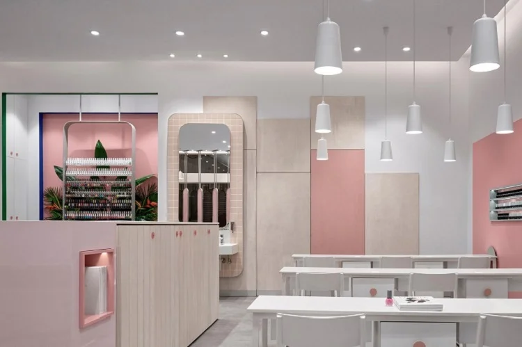
Professionail Hornsby asked Jason Byrne Design to create a new salon unique within the Professionail franchise family and what they have done is most likely the most divine nail salon EVER - check out the images below, I'm sure you'll agree with me!
The concept was inspired by the simplicity of the nail file, the shape helping to soften the linear lines which was required to order the stores functionality. The nail file concept evolved into privacy screens, niches for nail polish displays and a hand wash area. To encourage customers to explore the salon, zones were placed opposing each other, with the drying station, magazine and drinks station placed in a central zone. This central zone is the heart of the salon, providing direction and privacy for customers.
The salon celebrates femininity, embraces thoughtfulness whilst improving workflow. It’s modern, has a feeling of space; yet provides pockets of privacy.
Within the concept everyday materials were elevated to be luxurious. Paints were selected in flat and glossy finishes, appearing similar but offering different qualities and experiences. The accent green and blue paint is deliberately chosen to encourage customers to have fun with their nail polish colour selection. They are playful statement colours, surprising and bold, making customers look twice.
The end result – their client’s description of the store, ‘Cuban Barbie Gone Wild’ – and what’s better than that!
Professionail Hornsby was recently shortlisted as part of The Dulux Colour Awards 2018.
“We were inspired by the simplicity of the nail file while evolving the stores concept. The nail file shape softens the linear lines which order the stores functionality. The store embraces greys and pinks as the predominant colours. Flashes of green and blue delineate changes in the layering of materials. These greens and blues also seek to encourage customers to have fun with nail colour selection. The store celebrates femininity and emphasises the fun and beauty of a visit to a nail salon.” says Jason Byrne of Jason Byrne Design.
The Client: Professionail Hornsby
@professionailhornsby
The Shopfitter: Danielle Guo | Addison Joinery
The Photographer: Justin Alexander
@justinalexanderphoto
The Floral Arrangements: Bird Wood and Bloom
@birdwoodandbloom
The styling: Kris Won
@kri.ss.ii


