What you need to know about Interior Colour Trends in 2019!
Heidi Albertiri is the super talented founder, editor and stylist behind The Life Style Edit and we’ve called upon her to share her expert colour predications for 2019, ahead of her appearance in the Conversation Series at next month’s Life Instyle Sydney event.
The world around us is changing at a super fast pace, so it’s no surprise that the colour trends we can expect to see this year have been largely designed to assist us in slowing down and reconnecting to both ourself and our spaces. Colours set to have a strong presence in 2019 will centre around creating a sense of simplicity and calmness in our homes, disconnecting us from digital and busy-ness and essentially connecting with more authentic, grounded experiences. Think greenery, blushes and living coral features.
Inartisan
Greenery
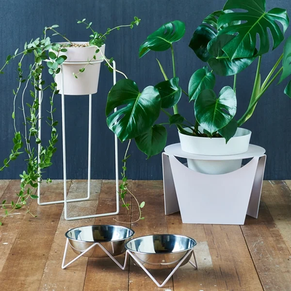
For 2019, green is still ever present, be it through plants, paint or soft furnishings - forest green is nurturing, calm and grounding. Found in varying palettes across the board, green is paired strongly with ground hues of the Australian landscape, such as ochre, rusts, cinnamons and sandy tones, which will continue to be reflected in the tones of this year.
Reflecting this trend is Life Instyle exhibitor, AKA. Adding touches of greenery to your home can instantly add that calm, grounded feel and AKA is the perfect way to add those touches in any room in your home. AKA creates tiny planters for succulents and cacti, making it really easy to add greenery to your surroundings without filling the space with large plants.
Another great way to add greenery to your home is through artwork. McMurtrie Illustrations has the perfect solution. With bold colours, the artwork adds both greenery and pink florals to any setting.
Bendo
Blush obsession
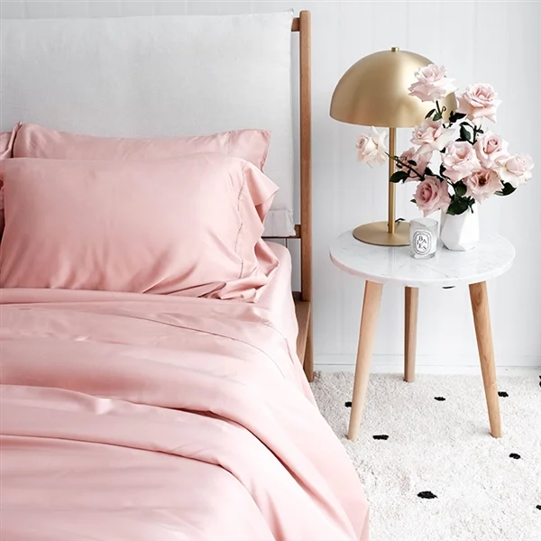
The obsession with blush will continue, however changes to the hue will come into play with dusty blushes and rosy neutrals. With a yearning to create peaceful zones in our home, we are searching out these softs blush tones to help us wind down. Paired with grey, greens and creams, these understated tones also add a simplicity that is timeless.
A really easy way to please your blush obsession is with Fleuressence. Renee Tsironis, founder of Fleuressence, creates beautiful imagery from freezing flowers and capturing the pinky tones in blocks of ice. The stunning photographs are perfect for adding a range of dusty blushes and rosy neutrals to your walls, without overdoing it.
Mulberry Threads
Long Courier
Living Coral
To spice things up, Pantone’s colour of the year is Living Coral. “Vibrant, yet mellow Living Coral embraces us with warmth and nourishment to provide comfort and buoyancy in our continually shifting environment.”
The colour of coral is social and spirited to encourage light heartened activity. Symbolising our innate need for optimism and joyful pursuits when work acts as such a heavy load for many of us, Living Coral gives way for some good old-fashioned fun.
Barefoot Gypsy
Turn Funky
Heidi will join the panel of industry experts taking part in the Conversation Series at the Life Instyle Sydney event next month, leading an informative session surrounding trend forecasting for the New Year.
For further information surrounding the Life Instyle Sydney event and how you can get involved, visit - http://www.lifeinstyle.com.au


