The Cecil Street Project | by Alison Lewis Interiors
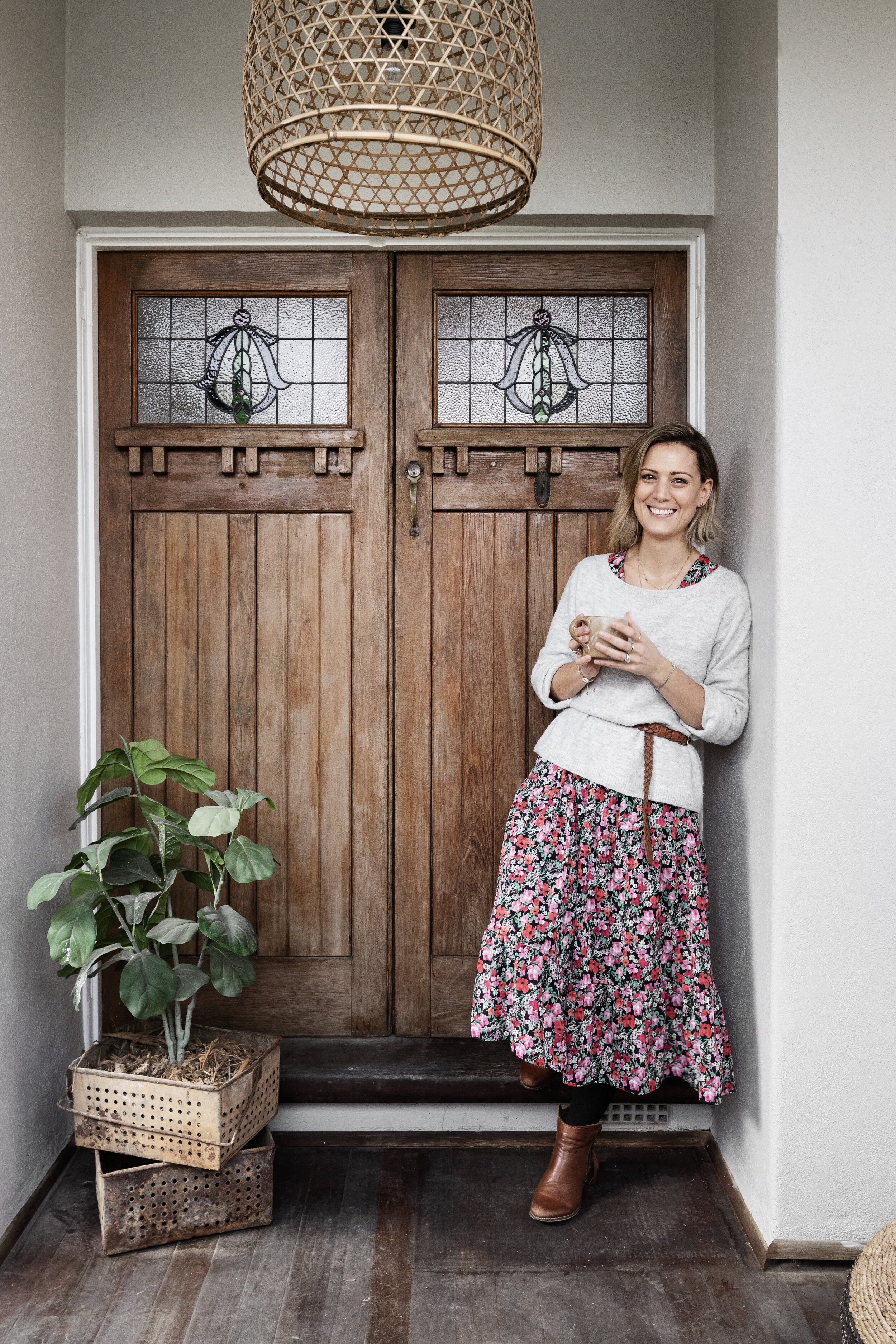
Alison Lewis is an interior designer, property developer and over sharer. Like many, Alison has worn a number of hats. From the time she was 14 and 9 months (to the day!), she threw herself into the workforce, collecting experience in a range of roles. With a tenacious work ethic and unwavering drive to succeed, Alison bought her first home at 25 and she hasn’t looked back! Add two more houses before she was 30, a 4-year stint in the UK and a career change, and you could say she likes to keep things interesting.
After a successful career in cyber security and finance, Alison craved creative stimulation, launching herself into Interior Design where she won several awards along the way, including runner-up at the Design Institute of Australia’s Student of the Year awards for Interior Design and Decoration.
With a career spanning interior design, property styling, editorial styling and most recently as the General Manager of boutique homewares brand Sage x Clare, Alison made the decision early 2020 to pursue her combined love of Interior Design and developing into a full-time career. Alison is incredibly proud to present her newly completed development The Cecil Street Project.
Pssst…. this incredible property could be yours! It’s just hit the market, check it out here.
As an interior designer, Alison had always dreamed about designing a period style home. When she laid eyes on this renovator’s delight offmarket nestled in Melbourne’s leafy Kew, she took a walk through video of the home for reference, verbalising ideas as she moved from room to room. The home had beautiful period details such as ornate cornices, 3.1m high ceilings and original Baltic pine floors but like most houses of this era, the space was dark and pokey and had a clunky floorplan.
Upon moving in, Alison didn’t begin the renovation straight away, instead she simply ripped up and replaced the 40 year old dust filled carpets and chose to sit thoughtfully in the property for 12 months. Alison cites this process as crucial in helping her understand the flow and best use of each space – not to mention the best light! Alison was able to visualise the impact a revised floorplan would make, allowing in an abundance of natural light, preserving and celebrating the period style features while bringing it into the modern era with more storage, high end finishes and a series of interior spaces that seamlessly flow into each other.
Coined by the builders jokingly as “the house from hell”, the project certainly had its challenges. The structural integrity of the 1930s home was compromised by particularly crumbly bricks throughout and when the back tiles were ripped up to reveal beautiful original Baltic floorboards, Alison’s jubilation was short lived as she quite literally fell through the floor! This forced Alison to redesign as she went along based on the issues that arose through the demolition and building work.
As she went to replace the windows overlooking the sun - drenched north -facing backyard, Alison and her builders found that the entire back section was no longer structurally sound, forcing them to spend funds meant for a skylight over the kitchen on rebuilding the back structure. Ever the optimist, Alison remained positive and in a stroke of fate, when the builders replaced the windows and Alison experienced the abundance of natural light it introduced to the space, she realised a skylight could very well have been overkill.
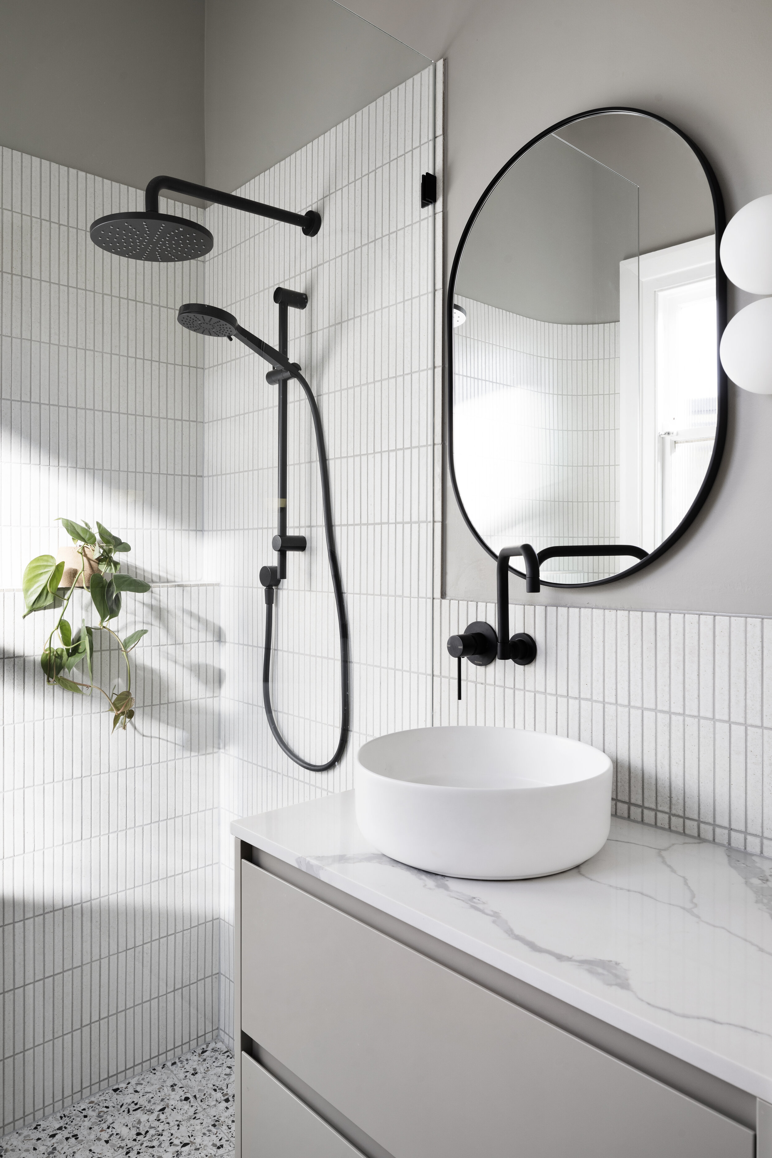
When Alison was re-working the floorplan, she knew she wanted to create another bathroom and relocate the laundry, which meant having to delete the hallway that led into her daughter, Ava’s room. Once she was able to establish she had enough room for a main bathroom and an ensuite, this then presented the challenge that Ava’s room would open directly out into the main living area. Placing a second door between Ava’s room and the open plan living has effectively soundproofed her space, as well as giving her some extra privacy, which has proven to be vital when dinner parties linger past bedtime.
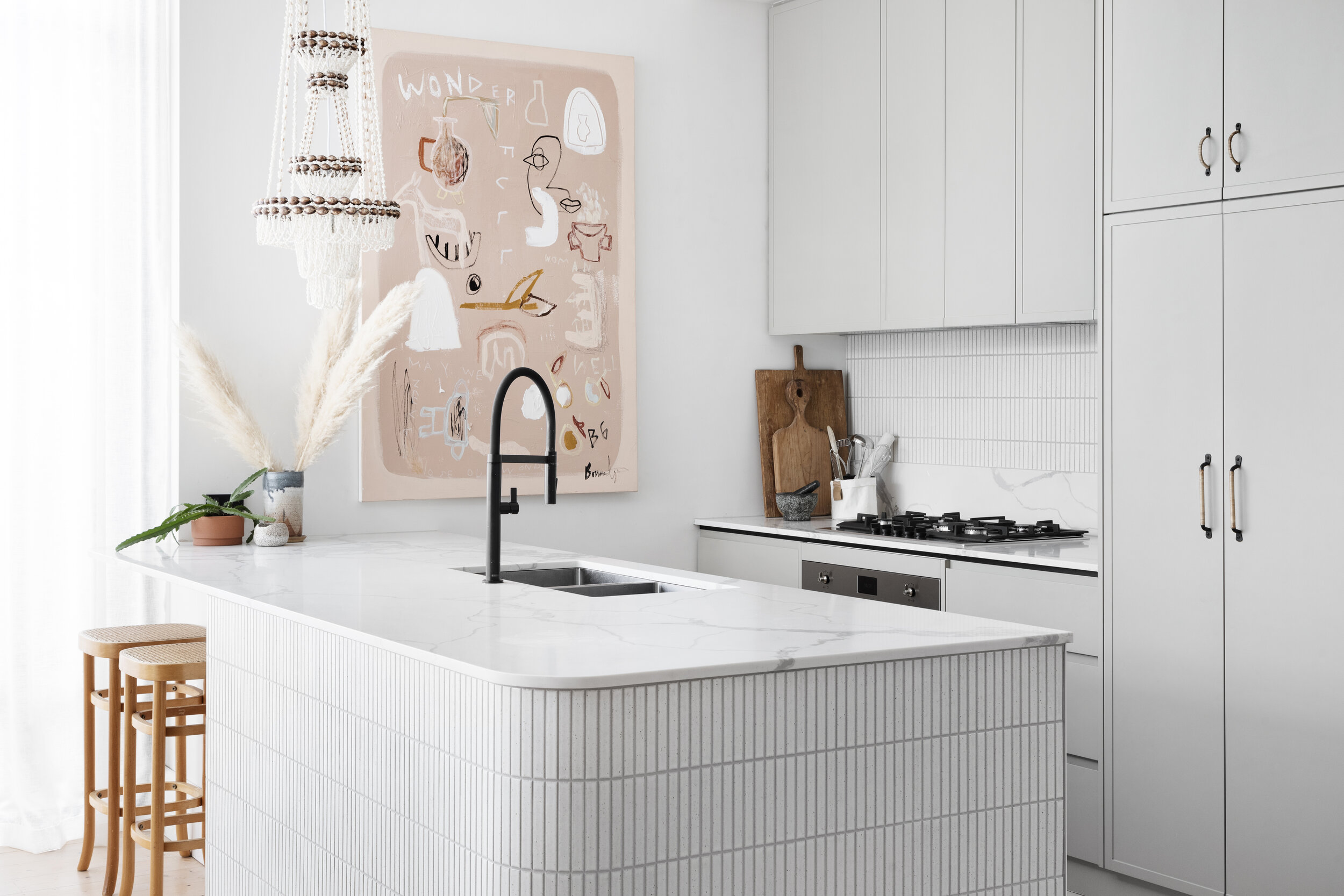
With bench space at a premium in the kitchen, Alison wanted to create an area that would be both functional and the perfect hiding spot for the most commonly used appliances. “It’s a beautiful space to put the kettle on, store my favourite ceramic mugs, tea and coffee but one that I also feel comfortable opening when guests came around!”
Alison loves what they have achieved. “I love that we’ve been able to open it up. The new open plan floorplan means the kitchen, dining and living spaces all have a harmonious and beautiful relationship to each other. Adding value to a home so that I leave it better than when I first found it is my definition of a successful renovation.”
And this beauty could be yours - it’s just hit the market!
Check it out HERE.
Interior Design and Styling: Alison Lewis Interiors | Builder: CJ and C Construction | Photography: Dylan James Photography
Suppliers:
Window Furnishings: DIY Blinds Cabinet Maker: (Kitchen) Project Cabinets (Bathrooms) Kitchens by CJ (bedroom) Ikea Handles: The Society Inc. Artwork: Bonnie Gray Bedhead: CCSS Rug: The Rug Collection Lighting: Tigmi Trading , Marz Designs, Barnaby Lane, Sphera Lighting, House of Orange, MRD Home Tiles: (Mosaics) Academy Tiles (Terrazzo) Defazio Tiles Bedding: Sage x Clare Coffee Table: En-Gold


